Be forewarned. After you read this post, you might curse me for lodging a thought in your head that you simply can’t shake. You’ll think back to this post every single time you’re standing in a corporate lobby or reception area. For me, that’s about 10-15 times per week.
Try to recall the last time you were patiently waiting in a lobby of an office. Do you remember what was around you as you sat there? Maybe not. Many of us revert to the Pavlovian check-in on work e-mail in that situation. But if you spent any time soaking up your surroundings, what impression did that give you of the organization and its people?
Brilliant architects get paid big bucks to design “wow” experiences for these otherwise mundane moments. The tone is set to match the brand persona, if the designers are any good. The subconscious kicks in, and you make knee-jerk judgments about the organization. Whether it’s sleek, playful or austere, an expectation is set based on that environment. Yet, I’m amazed at how few companies use this space to project their purpose more effectively.
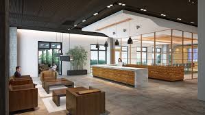
Carol Summerfield recently wrote about how a well branded space is more than just a logo on a wall. It should easily telegraph the mission, vision and values of the company. And it’s also more than aesthetically pleasing design, though that’s part of it.
Every day, I come across another thinkpiece about how the talent war is on, and it’s about winning hearts AND minds. This race starts well before someone enters your organization’s physical space. It could be a phone conversation, a visit to your website or something they read on one of your social media platforms. When they come into your work “home,” how will that experience set you apart from the competition?
Think about how much time, money and energy your company puts into your company’s website, social media channels and external communication. Now think about who walks in and out of your office every day:
- Current staff
- Potential employees
- New business prospects
- Existing clients
- Vendors and strategic partners
Yup, pretty much everyone that is vital to making your organization live and breathe. Yet, how much thought have you put into using your company’s “front door” as a sticky communication touchpoint?
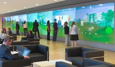
Here are three key components of great welcoming areas:
1. The “why” is obvious: The days of overly compromised, poorly worded, crooked-frame versions of mission statements will go the way of the rotary phone. Instead, visual examples of how your company is making an impact will be conveyed through striking imagery, compelling video and other visual platforms.
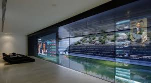
Through these media, the answer to the subconscious question of “why” your company exists should be easy to understand, instantly.
2. Dynamic, changing environments: A legendary biotech CEO once told me “100 percent of my company’s assets walk out the door every night at 5:30 pm and then, thankfully, walk back in the next morning.” Think about it. There is one single place that nearly every employee passes through at least twice per day, and perhaps more due to lunch, short breaks, errands and so on. You guessed it — the reception area.
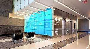
One of the biggest problems with static messaging (such mounted photos that never change) is that it becomes white noise to employees after a while. In the future, many lobby areas will include a multi-screen environment with interactive capabilities that provide a framework for telling various stories that change regularly. To execute this, marketing teams will need to think like television programmers, accounting for the wants, needs and compelling ways to reinforce how the work a company does is making an impact.
3. Measurable results: The lobby and reception areas of the future will be a target of significant investment. There are the upfront costs, sure, but the larger commitment will be the time and energy needed to keep it dynamic and relevant. The same strategic framing questions you ask about other marketing initiatives will need to be applied here. What’s the goal of the communication? How will you measure success?
The beautiful part is technology can now afford you a high degree of interactivity and engagement power. Perhaps you’ll be able to measure it by how many people respond to a call-to-action in that space. Smart marketers will think of this as a marketing media lab, offering insights, feedback and an ability to constantly adapt messaging so it’s more resonant — and measurable.
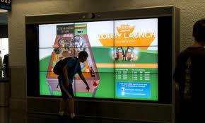
I see these three components as the bedrock of future corporate spaces, particularly firms struggling to connect with purpose-driven Millennials. However, don’t confuse that to with trying to be glitzy, glamorous and expensive.
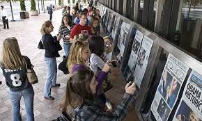
The Newseum in Washington, D.C., is a great example of how to do it right. Before you even enter the building, you are “wowed.” Every single day, they display a hard copy of the front page of the major paper in all 50 states, along with dozens from countries around the world. You don’t even need to enter the building to know this history of news museum is a) about educating you on news, and b) current, progressive and not dusty.
Meanwhile, within a mile of this building is National Geographic’s headquarters. The progressive brand that has become a social media darling due to its library of exquisite imagery also has a lobby that features little more than photos mounted on foam core. It’s a major letdown from what you expect and, to me, sends a message that creates pause.
If you’ve got a lobby or reception area that nails it on projecting purpose, or if it’s a strong candidate for the “how not to” award, send it my way. Let’s help put Purpose in Practice. E-mail me at Jay@TeamWorksMedia.com or connect with me on Twitter at @_JaySharman.
